David & I worked on the Harley account together. I always liked the way he could get some traction on a project – take the lead and get some ideas on the wall so we wouldn’t waste too much time sitting around scratching our heads.
During the mid-90s, Harley was coming to terms with their need to connect with younger riders and suburban audiences, but their brand was perceived as threatening and exclusive, rather than inclusive, to some. We were also challenged by the client to bring technology to the forefront as a way of attracting new audiences, and reinforcing the price-point of each product.
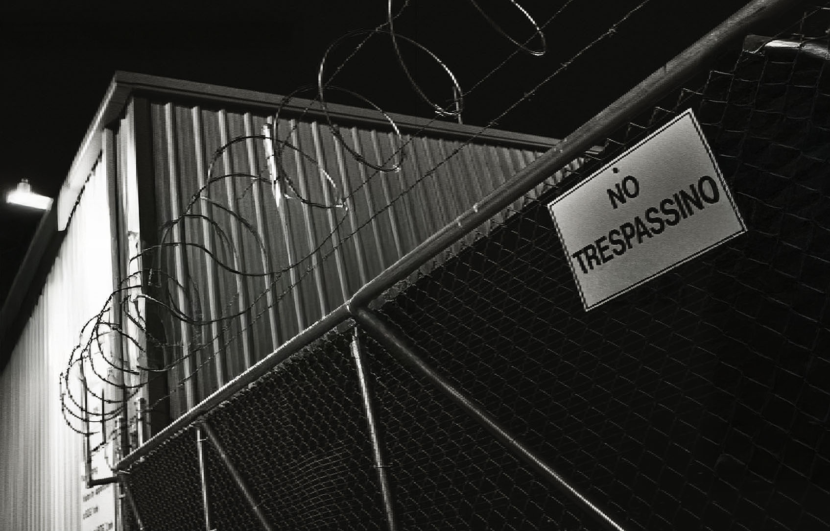
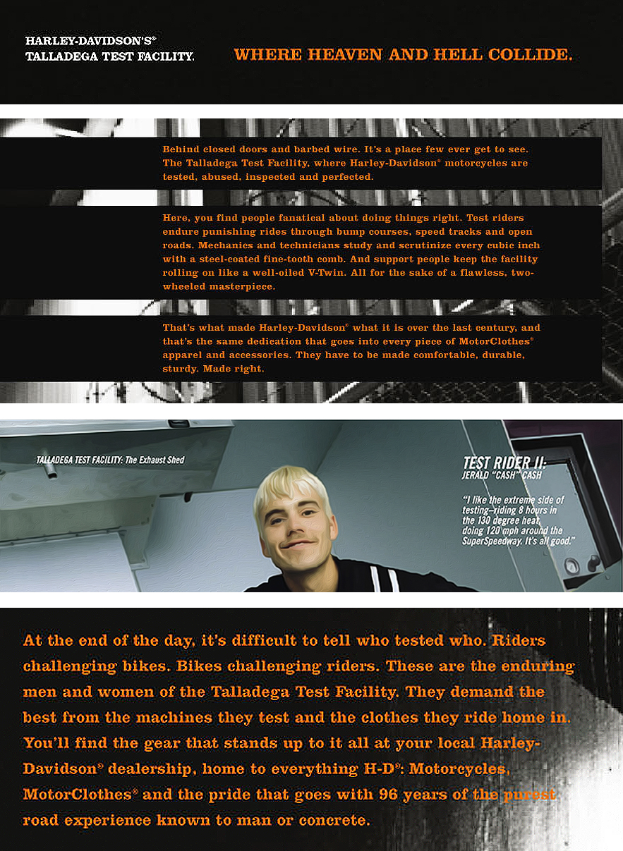
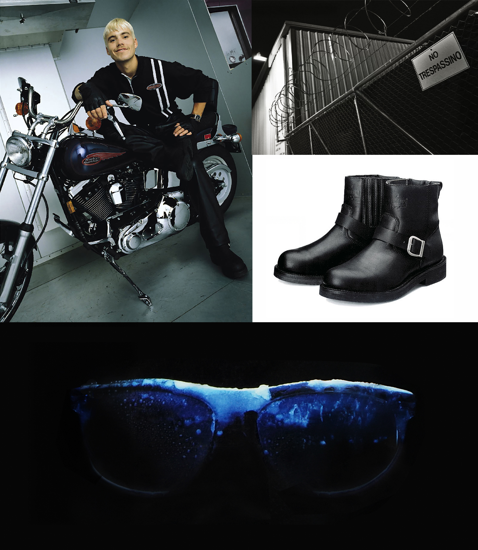
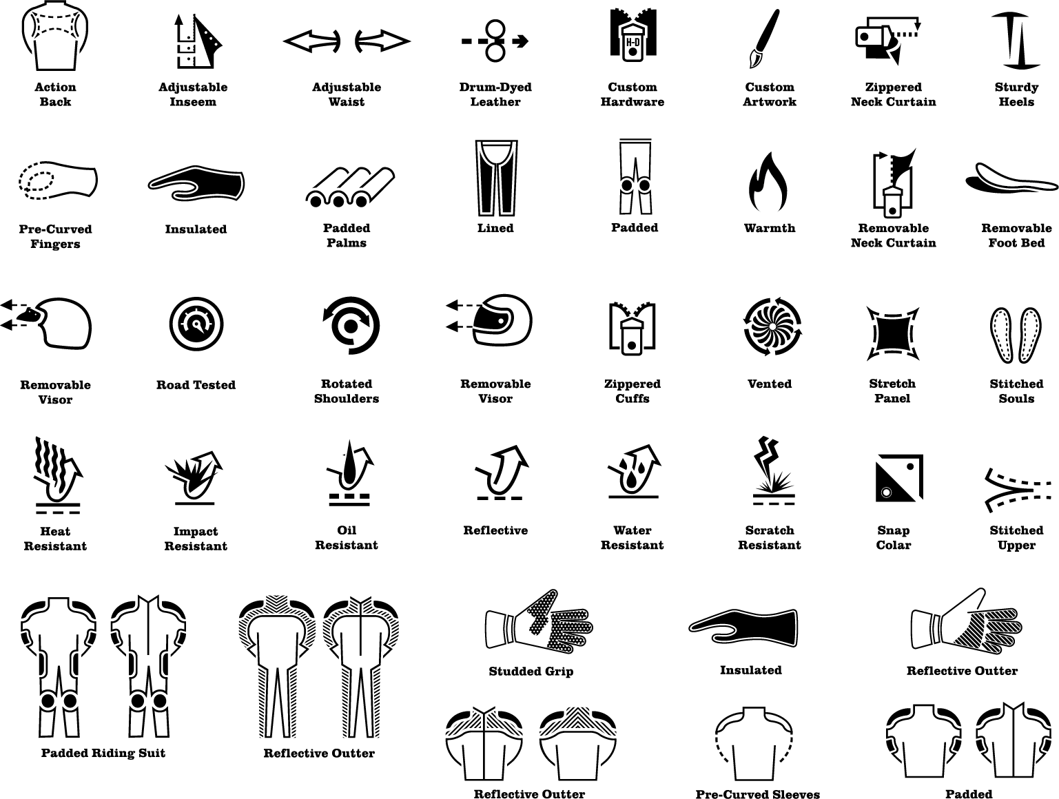
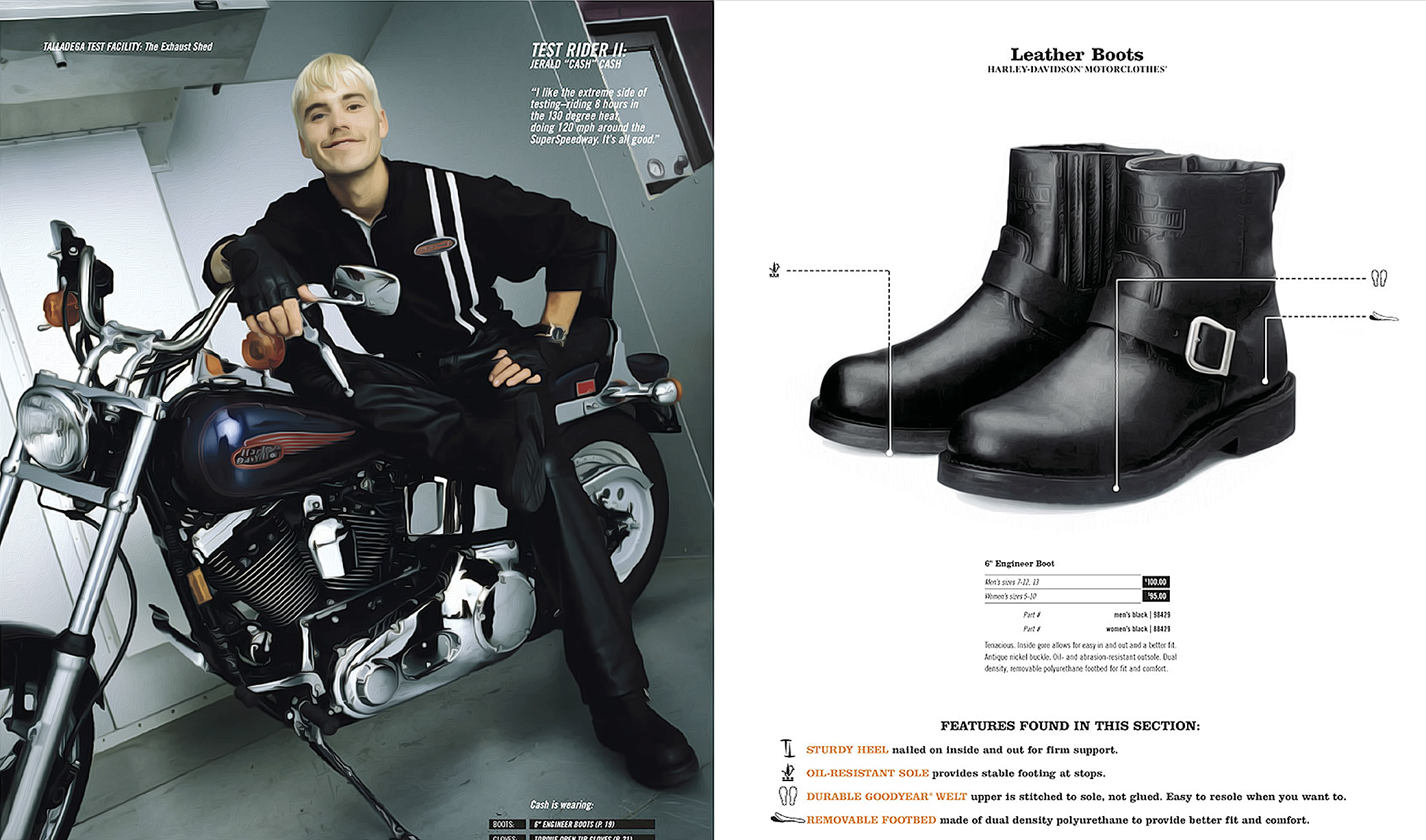
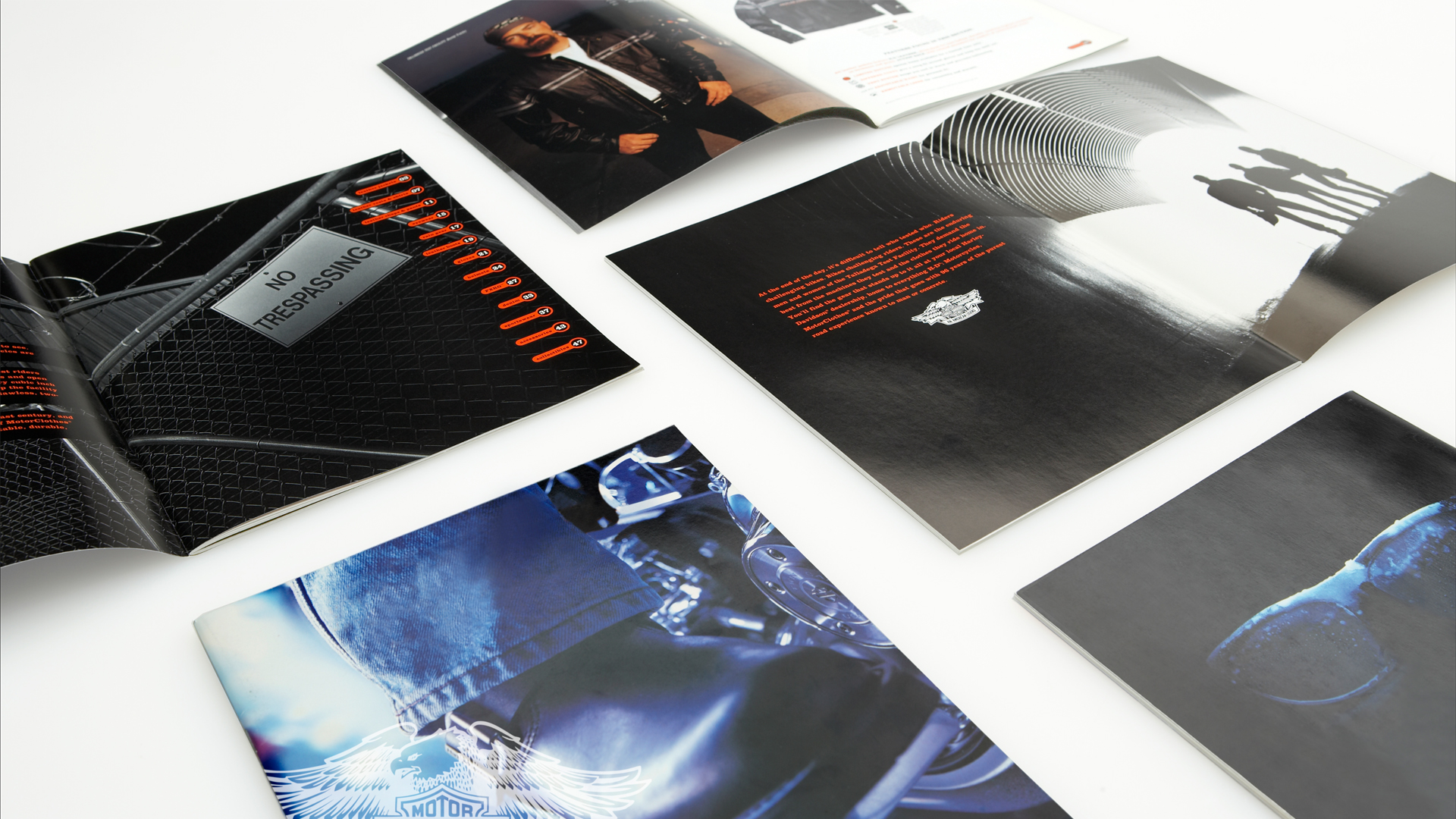
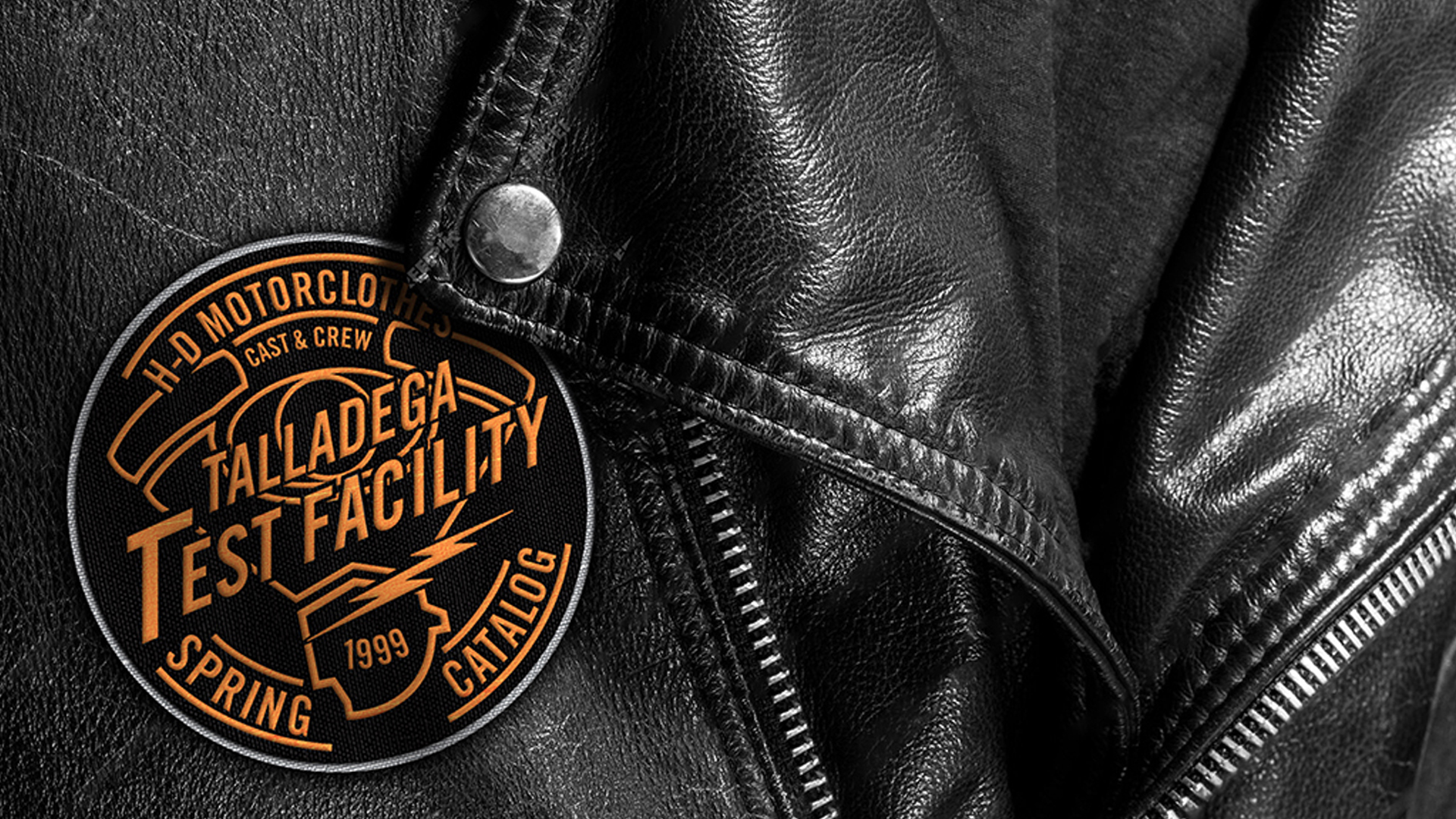
Our solution centered on providing all riders with an exclusive, behind-the-scenes look at Harley-Davidson's Talladega Testing Facility. By featuring real test riders as the talent, we emphasized the authenticity that sets Harley apart. Additionally, we showcased Harley’s technological innovations as a key driver for attracting new customers. By highlighting the advanced engineering and features of each product, we reinforced the brand’s value and justified its premium price point. This approach positioned Harley not only as a heritage brand but also as a forward-thinking leader in the motorcycle industry, helping to break down barriers and welcome a new generation of riders into the Harley-Davidson community.
Brand, Print, Custom Art, Digital, Web
Collaborated with the Creative Director, Account Manager, Print Manager, Writer, and client to ensure alignment across all project elements.
Worked closely with the Writer to establish an “Inspirational” brand voice that resonated with the target audience.
Selected fonts that reinforced the brand identity and enhanced visual consistency.
Developed the strategic approach and executed the final design for the catalog.
Co-presented the creative work to the client in partnership with the Writer, ensuring clarity and alignment with the project goals.
Applied all client feedback and refinements to the final designs.
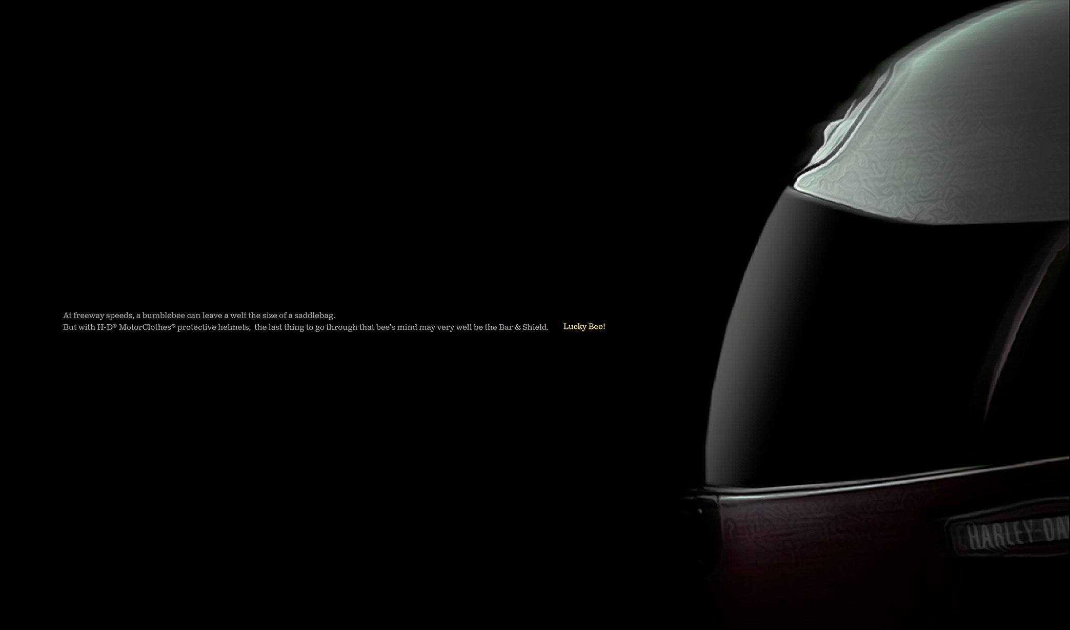
Art directed both on-location and table-top photoshoots, ensuring visual cohesion across all assets.
Collaborated with the location photographer to identify optimal shooting locations that aligned with the brand's aesthetic.
Worked with the table-top photographer to craft the ideal visual presentation for product showcases.
Partnered with the stylist to coordinate rider and product pairings that reflected the brand image.
Worked closely with the client on set, ensuring their vision was fully realized.
Provided expert consultation on prepress proofs to guarantee production quality and color accuracy.
Partnered with the Print Manager during the press check to maintain brand consistency and production precision.
David & I worked on the Harley account together. I always liked the way he could get some traction on a project – take the lead and get some ideas on the wall so we wouldn’t waste too much time sitting around scratching our heads.
Until 1997, Harley-Davidson's new product launches lacked impact. They needed a compelling narrative and an in-store campaign to drive their message and give dealers a consistent look for advertising the latest from Harley-Davidson.
One of the first things we did to make this event more special was name it, “The Harley New Year”. We also created the logo for this year's event, focusing on the biggest reveal in 1999, the new 88 cubic-inch engine.
Brand, Digital, Print, Naming, Marketing
Collaborated with the Creative Director, Account Manager, Print Manager, Writer, and client. Worked directly with the Writer to develop an “Inspirational” brand voice.
Selected fonts that aligned with the brand identity.
Developed the approach and final design for the logo.
Designed and laid out four distinct ceiling danglers for Bikes, MotorClothes, Parts, and Accessories.
Presented the work to the client in collaboration with the Writer.
Provided consultation on prepress proofs to ensure production quality.
Partnered with the Print Manager during the press check to maintain consistency and accuracy.
David brings thoughtful, strategic creative direction to every project he leads. He quickly and thoroughly understands business objectives, even when clients struggle to articulate them. David seamlessly integrates consumer and channel insights into the concepting process, ensuring these are reflected in the final creative product. He leads in a professional, respectful manner, consistently leaving a positive impression after each interaction with him and his team.
The Harley Owners Group (HOG) sought to revitalize its visual identity to appeal to a younger generation of riders. Their existing brand imagery lacked a fresh, youthful perspective, which limited its appeal to new, up-and-coming riders. Partnering with Wolf Inc., we were tasked with developing custom graphics to invigorate the brand and attract a younger membership. Our mission was to generate excitement around HOG, showcasing it as more than just a community of like-minded riders cruising into the sunset, but as a dynamic, diverse group embracing the thrill of the ride.
We tapped into the iconic Harley-Davidson vernacular, blending its deep-rooted legacy with fresh, contemporary design elements. By honoring the brand’s heritage while infusing a youthful energy, we crafted custom graphics that resonated with both long-time enthusiasts and a new generation of riders. These visuals reflected the adventurous spirit of HOG while positioning the group as an inclusive, dynamic community for all riders. This approach helped to broaden HOG’s appeal, sparking interest and excitement among younger demographics and enhancing their membership growth efforts.
Brand, Custom Art
We seamlessly collaborated with Wolf Inc., working hand-in-hand from concept to execution to ensure the designs captured both Harley-Davidson’s heritage and the youthful energy needed to attract new riders. Our collaboration involved an iterative creative process, where we exchanged ideas, gathered insights, and refined the approach to align with the vision of a more vibrant, inclusive Harley Owners Group.
In developing the visual concepts, we presented numerous design options, each tailored to appeal to a younger audience while staying true to the brand’s core identity. These varied approaches provided flexibility in tone and style, ensuring HOG had a dynamic range of visuals that could be deployed across multiple platforms and mediums.
For merchandise, we paid particular attention to how the graphics would translate to apparel. By carefully considering scale, placement, and the overall aesthetic, we ensured the designs were impactful and visually engaging when applied to shirts and other gear. Our goal was to create apparel that riders would not only wear with pride but that would also serve as a bold, visible representation of the evolving spirit of the Harley Owners Group.